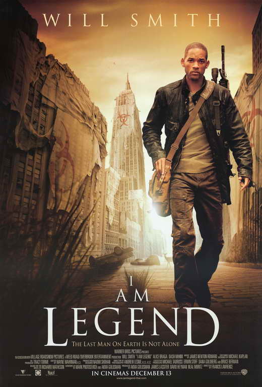
It is made clear that the main setting for this film is New York City, the spectator can see the Empire State Building which is an iconic building in New York. The spectator will also be able to tell that Will Smith is the main character in the film, he is the only person present in the whole image and is the closest thing in the image to the foreground.
The title of the film is ‘I am Legend’, the spectator will immediately see this as it is written in big bold type at the bottom of the poster, white typography has also been used to make it stand out against the black background. The font does not really give away anything about the movie but as all the text is written in the same font the poster looks a lot more slick and professional.
Will Smith is the star of the movie, the spectator can easily tell this as not only is he the only actor present on the poster, making him the main focus, his name has also been included on the poster. This has been included to draw viewers to the poster as he has immense star appeal. The image in this poster depicts a morbid and desolate New York that appears to have been destroyed. There are also overturned cars and plants growing in the streets, hinting that New York has been abandoned for some time. The spectator can see that on each of the buildings in the image theres a hazchem symbol which means that something is biologically unsafe. This then reveals to spectator that the movie could be about biological warfare and that each of these buildings are unsafe to enter. The whole mise en scene of the poster hints to apocalypse. These images have been included to give the spectator clues about the narrative of the movie.
 In the poster there is the use of light and darkness and the specific placement of these elements could signify different things. The poster has used backlighting in order to create a halo of light around Will Smith’s character. This halo of light could indicate to the spectator that his character is the ‘good guy’ who has come to save the day. As light stereotypically represents good. Whereas darkness stereotypically represents evil, the fact that the darkness is around the edges of the poster creates perspective, as if Will Smith is walking toward the spectator.
The colours used on this poster create a sepia effect and this creates a sense of mystery and eeriness. There are only four colours used on the poster in various shades: yellow, brown, black and white. This colours can connote warmth, as yellow and brown are quite warming hues. In this context they appear to connote death and illness and this links back in with the theme of the poster/film. The colours used make New York City seem a lot more isolated and quiet than if a normal blue sky had been used. The replacing of the blue sky with a yellow/brown/black sky makes it seem as if something is wrong and out of place in this film. The colour scheme is subtle, and yet still effective as well as hinting to them what genre the movie belongs to.
This poster follows the typical layout for a film poster, it is presented in portrait. The font is a squared off and slightly sharp font, that on this poster has been used in a white typeface. Will Smith’s name is placed at the top, so this is what people will see first. This could have been a technique used in order to engage the audience, as if they see Will Smith’s name they will keep looking at the poster.
There is a tagline present under the title, it is ‘The last man on earth is not alone’. This tagline is very mysterious and makes the viewer question what is out there if he is not alone? The tagline creates a sense of enigma for the viewer. It could also perhaps hint to a confrontation or discovery in the film by Will Smith’s character, so the viewer could expect that to happen in the narrative.
There is no credit block on the bottom, however, there are a few logos of the companies who have contributed to the film in some way (the production and distribution companies). The only information we get from this poster is who the main actor is, other than that there is no information about specific people that have contributed to the film. The poster does include a website underneath the ‘coming soon’. This is in order to get the audience to engage with the film before it is even released, if an audience actively engage with the film through a website then they will be more likely to go and watch the film when it is released in the cinemas.
The target audience for this poster are males between 16 and 40. I have gathered this from the mise en scene, and in particular the inclusion of weapons on the film poster (Will Smith holds a gun), as weapons are very often a sign of masculinity and action.
No comments:
Post a Comment