Monday 14 December 2015

Our Final Poster

This is our final poster for our short film "Alien". We have also uploaded the original photo in order to show the contrast and the work we have done to it.

The Final Poster

The Original Image

Tuesday 8 December 2015

Poster Draft (Naomi)

This is just a draft of what could be our final poster for our short film,  I've used one of the images from our short film and added more colour and the title of the film to make it stand out more, I've also made a billing board at the bottom of the poster which says who the directors, actors, ect. This isn't anywhere near completion but this is just a rough idea of what we might use.

Friday 27 November 2015

The Dark Knight - Filming Analysis

When the menace known as the Joker wreaks havoc and chaos on the people of Gotham, the caped crusader must come to terms with one of the greatest psychological tests of his ability to fight injustice.
The main focus you would look at within this poster is the antagonist called 'The Joker', in The Dark Knight he is the badguy within the film, as you can see from his costume he wears a purple long coat, green waist coat and shirt and black trousers, he holds a gun and his face is painted clown like but has been smudged, giving him a very scary horror look, the fact that he is holding a gun also makes him very dangerous.
In the backgound you see the colour has a much lighter silhouette around where the photo of the Joker has been placed, this is probably because the Joker was meant to be the main object to look at within this poster, as he is the main 'bady' in the film. 
Also within this film poster background you see buildings of where the film is based in America and lots of  debris flying in the air, and there is sparks flying up giving the poster a dangerous look, as you know the film will be action packed. 
Altogether the film poster has a very dark look to it, and the way that 'The Joker' is looking straight into the camera gives the audience chills as if he looks crazy; the title of the film has their normal batman logo in it which appears in most of the films and the white captial font have been placed in the middle of the bottom screen, it really stands out in the poster designed as it is lighter than most of the poster itself
The target audience for this film would probably been aged as young adult upwards as there is a lot of violence within the film and wouldnt be suitable for younger viewers    

'Romeo + Juliet' Poster Analysis (Ella)

The purpose of this poster is to show the mixture between romance and violence of the families within the movie. The main image is a young couple kissing with the surrounding families looking like they are ready for a gun battle. Regardless of how violent everything else is around them, there is a shining heart at the top of the page showing how powerful their love is for one another. Background: The background is a swirl of strange colours, fading into each other with families and the couple in front of it all. The colours used give the poster a surreal feeling, the purples and greys make it look like a storm is coming at the edges of the pages where we can see the families ready with their weapons. And the orangey golds everywhere else make it seem like the heavens are opening for the young couple in the centre. 

There isn’t much realism to this poster, we can see that nearly all of it has been edited, the surreal colours and the families at the sides have been colour edited. Text Colour: The bright white is used for the title of the film, contrasting against the other colours. It makes it easy to read and makes it stand out, over the couple. The tagline is in black with a yellow outlining under the shining heart. The small print is in dark orange at the bottom, so it doesn’t stand out much and the date in the small print is white too. Tagline: The tagline, although small reads “my only love sprung by my only hate” this helps us make more sense of the battling families at the sides of the posters. This hatred has bought a young couple together despite everything else. It is a very strong, very romantic powerful tagline. Text Font: The font is very bold for everything, makes it easier to read the names of the actor/actress, the title and even the tagline too.


Target Audience: The target audience for a film like this, of course would be Shakespeare fans, and also lovers of romance, violence and drama. I think for its time that it was made this is a very well edited and good take on surrealism for a film poster. It has everything in it that we need to know. The love is strong between the couple and the families are clearly very violently at war with one another. The layout of the poster is well spread out. Even though there is a lot going on we can clearly see there is a young and in love couple at the centre of this battle between the violent and heavily armed families that stand either side of them. The metaphorical love heart about them and the heavenly light stays central to the poster. So the violence does not take centre stage over the love of the couple.

127 hours - Film analysis

An adventurous mountain climber becomes trapped under a boulder while canyoneering alone near Moab, Utah and resorts to desperate measures in order to survive.
Firstly the poster for 127 hours is very colourful in the background of the poster you see a sunset of lots of different colours ombre downwards on the poster you could say that the blue at the top is very calming and as you work your way down below the rock the colours turn red and orange which connotes danger and death, you could say that above the rock is safe and below the rock shows a range of instability and uncertainty, also as well in the background you don't see anything as the film is based in the middle of nowhere. If you have never seen the film before its about a man who gets his arm trapped underneath a rock while he was mountain climbing, he is suck there waiting for someone to find him and after 127 hours when no one has found him he gets his arm free by cutting it off arm and running towards someone to save him. 
The rock in the poster is centred right in the middle of the poster and symbolises that is it one of the main things in the film and of course by the rock you see the protagonist of the film played by James Franco, the title of the film '127 hours' is centred in between the two mountains and underneath the rock and protagonist. The title is in bold and larger than the rest of the writing on the poster, the size and boldness of the title really makes it stand out from the rest of the writing and the colour of the title really works with the colours of the rest of the poster.
The target audience for this film would probably be young adult upwards, this probably wouldn't be interesting for younger viewers and also the gory part where the protagonist cuts off his arm probably isn't suitable for younger viewers.

'This Is England' Film Poster Analysis (Ella)

The names of the actors are not shown on the film poster. This may be because the actors are not well known and therefore won't make people want to watch the film. Another reason could be that it looks from the film poster that there are lots of main actors in the film and if they were to put all of their names on the poster it might look very cluttered and not aesthetically pleasing
On the front cover of the poster there is a picture of almost every actor in the film. This may have been actually photographed, but more likely superimposed through a green screen so that it is easier to deal with lighting, weather and so on. All text is kept away from the picture of the actors because it is the most important part of the poster.
All the text is centred apart from the strap line and the ‘Directed by Shane meadows’ which are placed aligned to either side of the title. These three pieces of test are placed at the top of the fence, the credit block is placed on the ground at the bottom and the critical praise is at the top overlaying the sky. These are cleverly placed so that they don’t cover up the background of the building estates. All the text in the middle has been placed to make sure that it is away from the picture of the characters but in the circumference of the fence
We can see from the reviews and ratings at the top that this film has been heavily praised by film festivals. It has won very big awards such as ‘Winner Best Film’ by the BFIA (British Independent Film Awards). This will entice a big audience because it is rated the best british independent film of 2006. There are two different types of critical praise on the poster. The first are quotes such as that from the observer saying “The directors best film yet. This is brilliant.” The second is the five star rating system in which total film gave 5 stars and empire gave 4.

The main image tells us about the film. For one it lets us see that these characters are poor because there are council estates in the background and also because the corrugated iron fence they are standing in front of is a convention of lack of money. We can also tell this from their hair and costume.The colours used for the font are Red, White and Blue for the English flag. This is why the colours links in with the name of the film Style: The style of the font is as if it is printed onto corrugated iron. This gives it an urban, decayed feel which links in with the theme of the movie.
The tagline ‘Summer 1983. A time to stand out from the crowd.’ gives us a sense of what the movie is about and links to the main poster image. It tells us the date in which the movie is set and by saying ‘stand out from the crowd’ it links to the image of the characters due to their odd clothing and shaved heads. 

he title is conventionally the largest piece of text on the poster and this poster fits those conventions. There is a very basic bold font, kerned so that each letter is fairly separate
Like almost all film posters, this one has a website. It is to get the audience involved in the film before, and leading up to, the films release. It includes things such as the films trailer, the release date and interactive apps


The credit block is a legal obligation for film posters. It tells the audience who and which institutions were involved in the production of the film and credits them. In this poster it is used conventionally; tucked away at the bottom so that it does not attract attention

Fury - Poster Analysis

A battle-hardened Army sergeant named Wardaddy commands a Sherman tank and his five-man crew on a deadly mission behind enemy lines. Outnumbered, out-gunned, and with a rookie soldier thrust into their platoon, Wardaddy and his men face overwhelming odds in their heroic attempts to strike at the heart of Nazi Germany.                                                                The poster has little colour on it is it made up with mostly greys, greens and whites. The only little part of colour on this poster is of the badge which has been sewn onto the main actors jacket; if someone has never seen this film before, I think they would be able to tell just from the colours of the posters that it is a gloomy film and doesn't have much happiness in it. The poster shows the protagonist male leaning on what could be the turret of a tank,which would have been used in the war. On the turret it has the title of the film 'Fury' written on it used with white paint, which someone has use a paint brush to do so. The protagonist is wearing a green zip- up army jacket, and a backpack (something which would be very important to keep safe at the time), he is looking down at the floor and doesn't have any facial expression on his face. He has mud on his face and clothes which suggests that it is a muddy winter at the time which you can backup by looking at the sky in the poster, as it is gloomy and dark. The target audience for this film could range from early adult upwards, this film has quite a lot of violence, blood and strong use of language therefore, it probably wouldn't be suitable for young people.
The actors name at the top of the poster 'Brad Pitt' is written in bold capital letters right across the top of the page, this makes the name stand out on the poster and really gets the viewers attention, the font style really goes with the poster, really well because its simple but grabs the attention due to the sizing of it. 

'Kidulthood' Poster Analysis (Ella)

The poster has a ‘in your face’ feel which is perfect for the characters attitude in the film. There are two characters standing up, one within the group of teenagers softly embracing one of the other characters and the other with a weapon cast of to the side in the shadow. 
The smaller black font at the top of the page is used to stand out from a lighter toned background, informing the desired target audience on a newspapers review of the film, followed by a star rating which helps engage and persuade people to go and see the film. The use of the power of three “Powerful moving and unforgettable” attracts the audience’s attention.

Including the name of the film director may persuade the people to watch it as they may have watched film by this film director before and enjoyed it. The baseball bat in the characters hand connotes a sense of violence. His character is of importance as he is standing up and is slightly away from the group and is alone which may suggest he is the antagonist. The bold white font used in this image is placed at the bottom of the page and is a contrast from the dark background. 

Above the film’s name it says ‘Before adulthood comes…’ this cleverly refers to the sequel film which they call “Adulthood” and the phrase above the sequel film’s name says “after kidulthood comes…” this shows that there is a sequence in the film this is used to attract the same type of audience as they become aware of both the films and it follows each other. ‘Kidulthood’ has a primary audience of teenagers, however, its secondary audience is parents, acting as a warning and creating awareness of what is going on in society. The ways in which the film allows the primary audience to identify includes clothing and worn by the actors and also the familiar setting of the film. The title is very interesting as it is a mix between childhood (kid) & adulthood (ulthood). This could suggest that although these kids want to stay innocent their situation forces them to become adults in mind with the harsh attitudes and violence that comes with it. However, because they are not ready to become adults they are stuck in the middle. The ‘I’ in Kidulthood is in lower case to signify how young and immature they still are. There isn’t a very wide range of colours in the poster. The colours of the fonts are contrasting; the white title being on the black ground and the black text being in the white sky. This is effective in making the specific parts eye catching. There is only one problem and that is the small print. The credit block underneath the title is also in white, however is quite difficult to make out. 


The clothing represents the stereotype of today's youth in a huge way with many of the characters wearing hoodies, tracksuits, trainers and hats. It represents the major issue of crime within today's youth many teenagers wear hooded pieces of clothing such as jackets and jumpers to cover their faces when committing a crime such as shop-lifting. The lighting used is high key lighting. It is mainly dark and is an indication of the darkness in the film and their lives. However, you can see the sun trying to breakthrough which may reflect on them trying to break through into adulthood. The genre of the film is easily recognised as social realism/ urban drama as the film poster has the stereotypical characteristics of a social realism/urban drama film. There is a website link at the bottom of the poster which allows the audience to find out more. The fact that the film has its own website suggests that it is very successful film.

The target audience for this film would be 15 - 25, this is due to the suggested themes of the film urban drama/violence/realism as well as the stars/characters in the poster being of that age group.

'I Am Legend' Poster Analysis (Ella)

It is made clear that the main setting for this film is New York City, the spectator can see the Empire State Building which is an iconic building in New York. The spectator will also be able to tell that Will Smith is the main character in the film, he is the only person present in the whole image and is the closest thing in the image to the foreground.

The title of the film is ‘I am Legend’, the spectator will immediately see this as it is written in big bold type at the bottom of the poster, white typography has also been used to make it stand out against the black background. The font does not really give away anything about the movie but as all the text is written in the same font the poster looks a lot more slick and professional.

Will Smith is the star of the movie, the spectator can easily tell this as not only is he the only actor present on the poster, making him the main focus, his name has also been included on the poster. This has been included to draw viewers to the poster as he has immense star appeal. The image in this poster depicts a morbid and desolate New York that appears to have been destroyed. There are also overturned cars and plants growing in the streets, hinting that New York has been abandoned for some time. The spectator can see that on each of the buildings in the image theres a hazchem symbol which means that something is biologically unsafe. This then reveals to spectator that the movie could be about biological warfare and that each of these buildings are unsafe to enter. The whole mise en scene of the poster hints to apocalypse. These images have been included to give the spectator clues about the narrative of the movie.

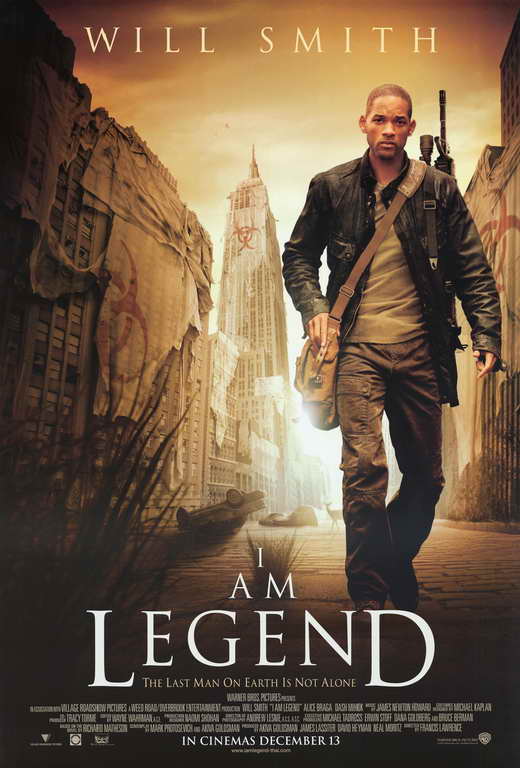
In the poster there is the use of light and darkness and the specific placement of these elements could signify different things. The poster has used backlighting in order to create a halo of light around Will Smith’s character. This halo of light could indicate to the spectator that his character is the ‘good guy’ who has come to save the day. As light stereotypically represents good. Whereas darkness stereotypically represents evil, the fact that the darkness is around the edges of the poster creates perspective, as if Will Smith is walking toward the spectator.
The colours used on this poster create a sepia effect and this creates a sense of mystery and eeriness. There are only four colours used on the poster in various shades: yellow, brown, black and white. This colours can connote warmth, as yellow and brown are quite warming hues. In this context they appear to connote death and illness and this links back in with the theme of the poster/film. The colours used make New York City seem a lot more isolated and quiet than if a normal blue sky had been used. The replacing of the blue sky with a yellow/brown/black sky makes it seem as if something is wrong and out of place in this film. The colour scheme is subtle, and yet still effective as well as hinting to them what genre the movie belongs to.
This poster follows the typical layout for a film poster, it is presented in portrait. The font is a squared off and slightly sharp font, that on this poster has been used in a white typeface. Will Smith’s name is placed at the top, so this is what people will see first. This could have been a technique used in order to engage the audience, as if they see Will Smith’s name they will keep looking at the poster.

There is a tagline present under the title, it is ‘The last man on earth is not alone’. This tagline is very mysterious and makes the viewer question what is out there if he is not alone? The tagline creates a sense of enigma for the viewer. It could also perhaps hint to a confrontation or discovery in the film by Will Smith’s character, so the viewer could expect that to happen in the narrative.
There is no credit block on the bottom, however, there are a few logos of the companies who have contributed to the film in some way (the production and distribution companies). The only information we get from this poster is who the main actor is, other than that there is no information about specific people that have contributed to the film. The poster does include a website underneath the ‘coming soon’. This is in order to get the audience to engage with the film before it is even released, if an audience actively engage with the film through a website then they will be more likely to go and watch the film when it is released in the cinemas.

The target audience for this poster are males between 16 and 40. I have gathered this from the mise en scene, and in particular the inclusion of weapons on the film poster (Will Smith holds a gun), as weapons are very often a sign of masculinity and action.

Wednesday 25 November 2015

The Skinny - Poster Analysis

The Skinny is a short film about a girl who gets dumped by her long term boyfriend for being too fat, Amanda embarks on a weight loss journey comprised of fad diets and quick fixes only to discover that true love and self esteem can't be measured by pounds. This short film shows the extreme of what men and women go through just to get the 'perfect body'.

The poster has little colour in it, it shows a fridge in it with nothing in it apart from a jug of water and a female (most likely Amanda) laying on top of one of the shelves inside, you don't see a smile or any sort of facial expression on her face and she is wearing a black long sleeve top, possible because she doesn't want anyone to see her body and black is considered a slimming colour. The simple, empty, boring colour of the fridge connotes what Amanda is feeling inside.. nothing!
In the poster you can see between the title and Amanda a measuring chart, the way that it has a curve going up and down is showing the weight of Amanda and the ups and downs of the weight loss and like how it is like a rollercoaster for her. Under the weight chart and over Amanda's body you can also see a measuring tape, this poster really gives you clues on what the short film is about.
The only colour on the actual poster is the title displaying ' The Skinny' the title is at an angle and is sitting on the fridge shelve. The size and width of the title really juxtaposes the name, as it is large and of course skinny means thin and narrow.  
By looking at this poster I think the target audience would range between early teens and upwards, from looking at the poster the film looks as if it could be a chick-flick, due to the young women and the pink titling colour, also just from the name of the short film you can say stereotypically teenage girls/women care more about their bodies than teenage boys/men; although this film can be targeted for men too. 

Wednesday 18 November 2015

Refilming Some Shots! (Ella)


Packing Scene Experiment

We couldn't make the decision on how to show Kasimirs packing, therefore I made a seperate sequence of four different ways to display this scene, such as one with a cross fade transitiona and one without etc. We went and got some audience feedback to help us decide.


Tuesday 17 November 2015

The Editing So Far.. (Ella)

As I am continuing to edit, I have realised that there are some shots that have not quite turned out the way I wanted. The begininng shots of the bedroom have turned out relatively dark which is a problem we have mentioned before, although luckily most of these shots can be fixed with an brightness adjustment on the Final Cut Pro video filters. Unfortunately using the effects appears to take away from the shots quality making them appear grainy.

Dissappointly due to our actors schedule we cannot refilm all these scenes however we can refilm James morning scenes. I will be filming this today to ensure the best quality of shot can be taken to produce the best quality short film.


Monday 16 November 2015

Beginning To Edit

This is our first video of us making a editing decision, We talk about two of our shot which we filmed for our short film, two of the clips have poor lighting and we try to use the effects on the computer to make the footage look more natural.
 

Wednesday 11 November 2015

Footage Organisation (Ella)

As we head into the editing phase, we have transferred our footage to the computer and are organising by labelling all our clips and exactly whats going on. Here is a short video of me watching and labelling clips. 

Monday 9 November 2015

Actor Alteration

Due to a last minute change to her schedule, Mollie was unable to act as Megan. 

Although her part was short, only handing a poster and in a few scenes, we believe that every cast member is crucial and all scenes have to be throughly planned through in order to be successful. 

In this circumstance fortunately we quickly were able to cast a new actress, Laurel Waghorn. As a good friend of mine Laurel was easy to work with and was available to film on the day we needed.    
                                                                                                                                                                                                                                                                                    Laurel Waghorn          

Saturday 7 November 2015

Health and Safety - Day 3


Every time that we film in a location we need to make sure that we make a health and safety risk assessment in the area that we are working in, this is so that we keep all our actors, actresses and crew safe.
For our day 3 of filming we had to travel down to Brighton to film our protest scenes, unfortunately on this day it was raining and this one of the first hazards that occurred to us, as we didn't want any of the camera equipment or lighting to get wet and damaged, so when we were filming we made sure we have someone else behind us holding an umbrella so that the cameras were covered. 
Another hazard was that when we are filming a anti-immigrant protest scene we didn't want to offend any of the public cause a dispute against the public, so rather than shouting the racist slurs out loud, we pre recorded everyone shouting in the protest so that we couldn't offend anyone on the actual day, therefore when we were filming the protest scene all the actors had to simply mimed what we recorded earlier.
As it was raining on the day of the protest and we were filming outside in the rain, we had to warn all our actors to wear warm suitable clothing (preferably waterproof), we had to do this,so that none of the actors got too cold and wet which would be a huge hazard for us because they couldn't go inside while we were in Brighton as our filming was all outside.
As we were filming outside with the general public around us we had to make sure when we were filming Theo (Kazimir) walking down the road, we didn't walk into any of the public or make the public feel uncomfortable because of the camera. Every time the street went quite we would film our scenes to make sure we didn't annoy or disrupt the public at all, this couldn't have been a hazard but we made sure it didn't happen.         

Friday 6 November 2015

Second Day Of Filming Evaluation

This is our evaluation of the second day of filming, here we discuss what went well for the day and what didn't, there were some slight issues during this day and in the video we explain how we overcame this and how our actor James (Jamie) got on with his role.
Hope you enjoy watching:)  


Thursday 5 November 2015

Second Day Of Filming

This is our behind the scenes (BTS) second day of filming on this day we filmed James (Jamie) morning of him getting up and eating breakfast, for the bedroom scene we found it difficult to get the lighting right because we obviously have to try and light the dark without making it too light but dark enough to show that it is the morning, but we managed in the end. We also made our spray chalk experiment where we had to test if it was washable, which was successful at first but when we finally tested it on Ella's door it left a mark, do then we had to think of an alternative location area of where we could spray the racist comment. 


Saving The Day (Ella)

As you can seen from day twos behind the scenes, our spray paint didnt work exactly to plan. This gave us a short time to quickly think of a solution enabling us to complete filming in time and be able to use the actors on the day we had arranged.

We could:
Attempt to photoshop the graffiti on.
- Spray it on a different wall.

Attempting to photoshop it would prove extremely difficult as neither me or Naomi have much expierence with the application. In addition after speaking to our technician we found that even for an expert in photoshop doing this would be difficult to make seem realistic as well as taking a long time.

Therefore the logical plan was to film it on a different wall. However this still presented its challenge as we will have to add in extra shots to our film, we need to make these fit with our film and its style. It has to still look realistic as if it is part of his house.
 

Tuesday 3 November 2015

Health and Safety - Day Two (Naomi)

Every time that we film in a location we need to make sure that we make a health and safety risk assessment in the area that we are working in, this is so that we keep all our actors, actresses and crew safe.
For our day one of filming we have to film at Ella's house, which we have permission from her parents, before we start filming we looked at all around the area to see any potential dangers to us and everyone around. We figured out how remove and possible dangers and decided how we would keep ourselves safe from any hazards we could not remove. The first location in Ella's house was her spare bedroom, one of the first hazards we noticed was that the lighting equipment gets very hot when its being used for a long time and someone might touch the glass on the light and burn themselves a way to overcome this hazard is to tell everyone in advance that the lighting gets hot and if they want to move the lights while we are filming, they must turn them off and wait for them to cool down before touching them.


Another hazard that we pointed out was that the bed was very low and someone might accidently  trip and fall over it which could cause a injury, a way which we could prevent this from happening is by making sure no one goes too near to the bed and by making sure that there isn't any objects under the bed which can cause someone to fall over and hurt themselves.
A alternative hazard that we found was that the desk  and chester drawers weren't very stable, a hazard that might occur is if the chester drawers the fell over while someone was stood in front of it, we will make sure on the day of filming that everything is very stable so that is doesn't fall down.
Finally the last hazard in Ella's spare bedroom is that people might trip over the camera and lighting equipment and hurt themselves a way to prevent this is by organising our equipment so that it wont get in the way of our actors and actresses, so that no wires are in the way.


We also had to film in Ella's kitchen which we also had to spot any potential dangers and hazards, in the kitchen scene we had to film Jamie (James) eating his breakfast.
The first hazard there is in the kitchen which we will have to think about, is making sure no camera and lighting equipment gets wet in the kitchen which could damage it, and potentially stop it from working. A way to make sure this doesn't happen is by making sure that no lighting or camera equipment is near any water substances that can cause the hazard to occur.


Another hazard that might occur in the kitchen is someone getting hurt by any sharp objects, such as knives and cutlery; we will overcome this hazard by making sure that all sharp objects are out of the way and no in danger to any of our actors, actresses or camera crew.

Another hazard in the kitchen is that actors might hit themselves on the kitchen counters and hurt themselves, so that this doesn't happen we will remind all the actors, actresses and camera crew not to walk around too quickly or run around the kitchen where the danger of hitting themselves is high. 
Another hazard in the kitchen is that actors might hit themselves on the kitchen counters and hurt themselves, so that this doesn't happen we will remind all the actors, actresses and camera crew not to walk around too quickly or run around the kitchen where the danger of hitting themselves is high.


The final location on day 2 of filming is to film outside in Ella's garden, we have test the chalk spray paint to see if it is washable, in order to spray paint Ella's wall. A hazard which may occur while doing this is getting the chalk spray on our clothes, we will have sure that everyone is wearing old clothes suitable for this task, so that if the spray paint does get on our clothes it doesn't matter too much.
Another hazard which might occur during the tester for the spray chalk is if it gets in someone's eyes, for us to overcome this we will make sure everyone sprays at least 2 metres away from anyone and make sure their face is no where near it.
As we are outside there might be weather changes which mean that it is muddy and wet therefore there is a hazard of someone slipping over and hurting themselves so we will make sure everyone is wearing suitable shoes which have lots of grip of on them. 
Also due to weather at the moment we never know if it is going to rain, so if we are filming outside we would have to shelter ourselves from the rain, so that none of the camera equipment doesn't get wet, if it does get wet there is a chance of it braking and therefore this is a huge hazard for us, if it does rain we will use umbrellas to cover the cameras so we avoid the hazard happening.