In what ways do your media products use, develop or challenge forms and conventions of real media products?
 Conventionally within short films, the camerawork includes a lot of close ups. For example in short ‘Blind Luck’. They also often use focus pulls, eye-line matches and graphic matches. The most frequent angle used is a mid level angle, typically used to show conversations between characters. Extreme-long shots are also seen with short films however are less common. Short films tend to include minimalist movement, aside from the occasional pan or tracking shot, they tend to conform to only using still shots. The conventions of camerawork used within our short film were medium long shots, medium shots and close ups, similar to that of the films I researched. We also made use of long shots occasionally to establish setting. Almost always using eye-level angles as with the real media products, this shows that we have used forms of conventions of real media films within camerawork. We also used a several tracking shots, again conforming to real media short films. However we challenged the conventions by using some extreme close ups not so commonly seen within short films. This was intentionally done to create a more atheistically pleasing and interesting film.
 Short films tend to use both diegetic and non-diegetic sound. This is mainly in the form of a non-diegetic soundtrack/music and diegetic dialogue. Non-diegetic sound is typically used for a contrapuntal soundtrack such as with ‘72 Kg’. The conventions of sound used within our short film was a non-diegetic soundtrack parallel to our film which although may have seemed challenging at the time, we believe has proved most affected. The happy track at the start misleads the audience into believing both characters are good. We also knew we wanted to use sound to convey the meaning of our short, such as with the on-screen diegetic protestors chanting and the non diegetic off-screen sound of the news clips all put together from different clips. We also heavily relied on music to create mood and atmosphere, towards the end when James sees the graffiti we chose to have a not typically sad but a piece of music with silence and intense low beats to continue to be parallel. This again would fool the audience into thinking the black screen meant an unhappy ending of the graffiti however by not having total silence they would continue to watch. By then suddenly cutting to a much happier track, combined with performance and brightened shots, it conveys the mood of the character as happy and furthermore the positive ending. This is common with short films as with ‘Mixtape’ the music within that reflects the characters mood and creates a positive ending.
Mise En Scene used within the real media films is minimalistic, everything in the shots are there for a reason. As short films typically have low budgets, its unlikely they will have lots of expensive set and props, makeup designs and other elements of mine en scene for example in ‘Just Say Hi’. In this short they have one simple public location, a bus stop and simply change costume to show passing of time. Facial expression and body language also play a key role in the mise en scene of a real short film, due to the typical low budget many shorts rely on the actors to create realism and to try convey their messages and values. The 180 degree rule is used within short films including one or more character, again for example in ‘Just Say Hi'. This creates continuity and flow within the short film. We spent a long time working on out mise en scene, each costume, decor, facial expression, lighting etc was carefully directed and planned and we are extremely happy with how it came out. From the very first shots of each of the characters rooms, you can see the england flag and other subtle hints of the story is Kasimirs room where as James is reading a newspaper with the famous cover of The Independent ‘Somebodys Child’ article with the heartbreaking image of the Syrian child washed up on a beach. This was to convey the meaning of our short and convey our a typical convention of shorts. We used the 180 degree rule with the conversation between Kasimir and his mother, we also used eye-line match with Kasimir throughout further following the conventions of shorts.
 Editing and post production plays a major role in bringing the short film together. Typically, cuts are the most conventional transition. However when attempting to manipulate time, to show time passing for example, dissolves or fades are used as in ‘The Best Medicine’. Furthermore, short films do not tend to have titling or credits, and if they do they are very minimalistic. Colour manipulation or correction is also commonly used, for example to make something more depressing, dimming the brightness to make the shot more black or grey as is evidently done in ‘The Black Hole’. Editing and post production were absolutely crucial to our short film. We conformed to typical short film conventions by using all cuts for our transitions. We also, had a very simple title sequence with “ALIEN’ showing up over a shot in plain white text, again similarly to shorts we researched. However when editing our credit sequence we hugely subverted typical conventions of shorts, as a lot of shorts don’t even include credits. However we chose to show all our actors, and both of us directors with full names and even shots of each. We wanted to do this as we attempted throughout to make our short film creative and original and believed this was another way to be experimental with our short.
 Characterisation typically in short film intentionally subverts stereotypes. This is shown with characters in short films we have researched, all of which audiences can either relate to or get a new perspective on the general stereotypes, perhaps questioning their own assumptions of people. This is shown in 'Silent Things’. In 'A Favour' the male protagonist acts as a reference of a stereotypical caucasian male father who many could relate to and they depict an Muslim man. The stereotype a lot of people sadly associate with Muslims is terrorist. This short is a classic example of diverting, specifically negative, stereotypes as the Caucasian man is actually the terrorist. This is exactly what we aimed to do in our film with James, an Asian character stereotyped to be an immigrant, who is actually British soldier.
 Steve Neale's theory states that a short film or feature film will either conform or subvert from the conventions used within genre. Typically, short films do not fit specifically into one genre, this is certainly true for the real media texts, short films, we researched. Therefore, they all seem to both subvert and conform in some ways. An excellent example of this is “Lovefield” in the beginning it follows typical conventions and iconography of horror, a scarecrow, a creaky old sign, an eerie soundtrack, bloody rags and a man with a knife. However it then subverts convention as it is actually a man helping a woman having a baby in a field. Our film we chose most fits with the genre social realism as it a realistic depiction of a situation contemporary life, with a means of both social and political comment. It relates comments on the current refugee crisis in Syria, which we took inspiration from.
The short films we researched commonly used Levi Strauss’ Theory of binary oppositions. They tended to use the binary opposite convention of good v bad, such as in ‘Blind Luck’. With our short film we conformed to this, using good vs bad. James representing good, an army man and Kasimir representing bad, essentially an ignorant racist.
Todorov's theory is sometimes followed but more commonly subverted make a more creative short film. Typically they follow the first equilibrium along with a disruption however from there onwards the ending seems to differ with each short film. For example with The Black Hole theres a disruption, recognition but no attempt to fix the disruption and therefore no new equilibrium.
Our story can conform to Todorov’s Theory as we intended it to;
Equilibrium - Kasimir and James breakfast routines.
Disruption - Kasimir protest, insults james.
Recognition - James see’s the graffiti.
Repairing the damage - Kasimir talks to his mum regrets his decision.
New equilibrium - James laughs, we see expensive car, he continues with his life.
 Themes and issues are evidently essential to our short film. We used race, the refugee crisis and ignorantly judging as central themes to our short. Many short films are based on real current issues and are used to comment on themes and issues which exactly what we tried to do with out short.
We did this based on our own research in which we realised that short film directors usually attempt to convey current themes and issues in their short.
Short Film Poster
There are many conventions used within film posters in terms of both content and layout.
When researching film posters, such as ‘Romeo + Juliet' and ‘This Is England’, I discovered the title of the film, is the most feature of a film poster. It is almost always, the largest text on the poster, stands out and is eye-catching. In both ‘Romeo + Juliet' and ‘This Is England’ they have used a bold font, in a bright colour that contrasts to the background which they are placed on.
We conformed to this convention with our own poster, making is a white font, with a subtle black shadow to make it eye-catching and stand out from the background on which its placed. It is important that the title draws the eyes of potential audience members so they are intrigued.
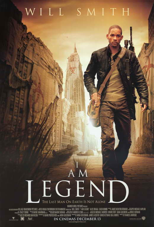
The second convention we found on the majority of film posters is the name of the actors. The actors names nearly always are shown on a film poster, this is especially true when the actor or actress is considered well-known. For example ‘I Am Legend’ shows Will Smith’s name at the top in large font. With our short film poster we did chose to have the name of the two main actors however we subverted this convention of large actors names as they were in a smaller font and in the top left corner making them less prominent as the actors we used were in this case, not considered well-known. This technique, known as using star power, attracts audiences based on their knowledge or like of this particular actor or actress.
Another typical convention used in film posters is that a large image of the protagonist/protagonists will appear on the short film poster. Usually being the main feature within the poster. As demonstrated in ‘I Am Legend’ and ‘Kidulthood’. The photograph of the protagonists is the most important section with everything else surrounding it in some way without distracting away from it. With our short film poster, we chose to have a close up of Kasimir our main character as the poster image. Again typical of film posters, as most will use a medium close up or close up at a mid angle. The actors names conventionally go with the image to help the potential audience in understanding which character is which actor. An example of this is ‘Romeo + Juliet’.
Within the film posters I have researched, a tagline is used in all for example “before adulthood comes..” on the ‘Kidulthood’ poster. The tagline typically is either a line from the short film or has gives context/meaning about the narrative or plot. As this is reveals some information of the film, it detracts from the enigma of the film poster intriguing audiences. We chose to subvert this by not including a tagline, we thought the poster looked more aesthetically pleasing without a tagline and that the audience would be more intrigued by our poster without a tagline.
A billing block is always used, whether it be in a feature film poster or short film poster. From our research its evident that although the billing block is always used, it always appears as subtle as possible. The billing block is usually placed at the bottom of the poster to assure it does not take away from the more relevant features for example the photograph and titling. It is also shown in an indistinct colouring and font, yet not deviating from the colour theme in the poster, as conveyed in ‘I Am Legend' with the billing block still being white. Below or next to the billing block could possibly be a website link for more information about the film. We conveyed to this by choosing to have a subtle, white small billing block at the bottom of our poster with a website link below this.
 Reviews and ratings are seen as extremely paramount by film makers and audiences in order to both promote their film and in relation to whether or not to go view the film. They typically promote the film and give information on its quality. It is usual that the reviews will appear above or below the name of the company that gave the review. They typically consist of a few words to a phrase. This is shown in ‘This Is England' with an example being “THE BEST BRITISH FILM OF THE YEAR”. They may also include awards that they have won and ratings again another example on the ‘This Is England’ Poster being ‘Winner Best Film’ from the ‘British Independent Film Awards’. In our poster we included a review from ‘Little White Lies’. It consisted of a few words and had a 4 star rating, this conforms to typical conventions of film posters.
SHORT FILM REVIEW
Our short film review was in the 'house style' of the Little White Lies magazine. As well as writing the review itself, we also attempted to relate our review as much as possible to one from Little White Lies magazine. In order to do this we had to look at the language, content and layout conventions and who reads the magazine.
Little White Lies is a bi-monthly magazine including film reviews, news on up-coming films, articles about films and actors/actresses. The target audience of Little White Lies, is people interested in film, who usually male and aged 25-35. This differs from our target audience, therefore we had to ensure our article appealed to both target audiences. As Little White Lies main readers are film fanatics they would most likely be interested in our review, as well as this we emphasised the focus our short film had on current events such as the refugees crisis as typically people aged 25-35 are interested in current events. Furthermore we ensured our picture was of our male character therefore attracting typically males in relation to Uses and Gratifications theory. (being able to recognise the product or person in front of you, role models that reflect similar values to yours, aspiration to be someone else.)
To start with we looked at the language and found that language conventions used within a typical Little White Lies Review are metaphors used to make the review more informal, perhaps also used to subtly reveal something about the plot without spoiling the entire film, though. Context used to give the reader more information about the film, adding to the humour and pleasure of the review. Puns again used to create humour and amusement. Complex nouns used to refer to people, places or objects within the film or sometimes out of the film, giving context to the reader. Quotes typically from the film, or again sometimes, from outside the film to provide context. It is also likely that quotes could be of other's reviews of the film. Restricted code in language used assuming knowledge from the reader, as well as giving the review a more formal and knowledgable impression. The main body of the review is strengths and weaknesses, this is typically paired with intensifiers such as adjectives or adverbs, this technique is used to give as much in-depth reviewing of the film to the reader as possible. We followed these conventions is our writing of the review, the attempt to give a similarly amusing, knowledgable, comparative review of the film.
 The conventions of layout are exact and we followed them using ‘InDesign’ to conform to the conventions of a Little White Lies film review. The document size used on 'InDesign' is 245 mm in height by 195 mm in width. A still image shot from the short film being reviewed is used at the top centre of the review, underneath it is the name of the short film in a bold century gothic font. Below this is the directors and actors names as well as the date the film was released all written in Aparajita font. The description is written in italics followed by the names or date in bold. To the left or right of this is the word 'reviews' in vertical, at the edge of the imagery and text. This text is Microsoft Yahei all in capitals. Below the release date, 52.4 mm in width and 107 mm in length is the main body of text, separated into two and a half columns.
The font size depends on the length of the review. The review is spread through the entire width of the column. New paragraphs are created through use of an indent at the beginning of the next line. The writers name Aparajita bold. Below the last half of the reviews text is a rating system separated into three rows - ‘Anticipation', 'Enjoyment' and 'In Retrospect' all in Aparajita bold. Following these words are comments by the writer about how they rated the film in each these sub-sections. This is all done in Aparajita italics. Beside the comments to the right in Century Gothic bold is a number rating the sub-sections between 1 and 5. For our own review we followed each of these exact measurements and the entire layout to ensure ours was following all the conventions.


